10 dazzling packaging design trends for 2021
As the year draws to a close, we’re looking forward to the new packaging design trends that 2021 has in store for us. At first glance, they look pretty different from each other—you’ve got simple geometry right alongside super-detailed ink drawings and fleshed-out characters. But there’s actually a cohesive theme here, and that’s a pivot away from packaging design that immediately reads as “commercial” and toward packaging that feels like art.
This year, we saw just how critical ecommerce is to our everyday lives. That’s not changing anytime soon. With ecommerce, you lose the experience of walking through a store and experiencing a curated brand ambience, something even the most immersive website can’t compensate for. So packaging designers and business owners are upping the ante to deliver a piece of branding right to your door.
The goal isn’t to replace the in-store experience, but to meet consumers where they are now and where they’ll be in the future. It’s all about creating a new, more immersive brand experience through the unique packaging trends of 2021.
Here are the biggest packaging design trends for 2021:
- Tiny illustrated patterns that reveal what’s inside
- Authentically vintage unboxing experience
- Hyper-simplistic geometry
- Packaging dressed in fine art
- Technical and anatomical ink drawings
- Organically shaped color blocking
- Product names front and center
- Picture-perfect symmetry
- Story-driven packaging featuring quirky characters
- Solid all-over color
1. Tiny illustrated patterns that reveal what’s inside
—
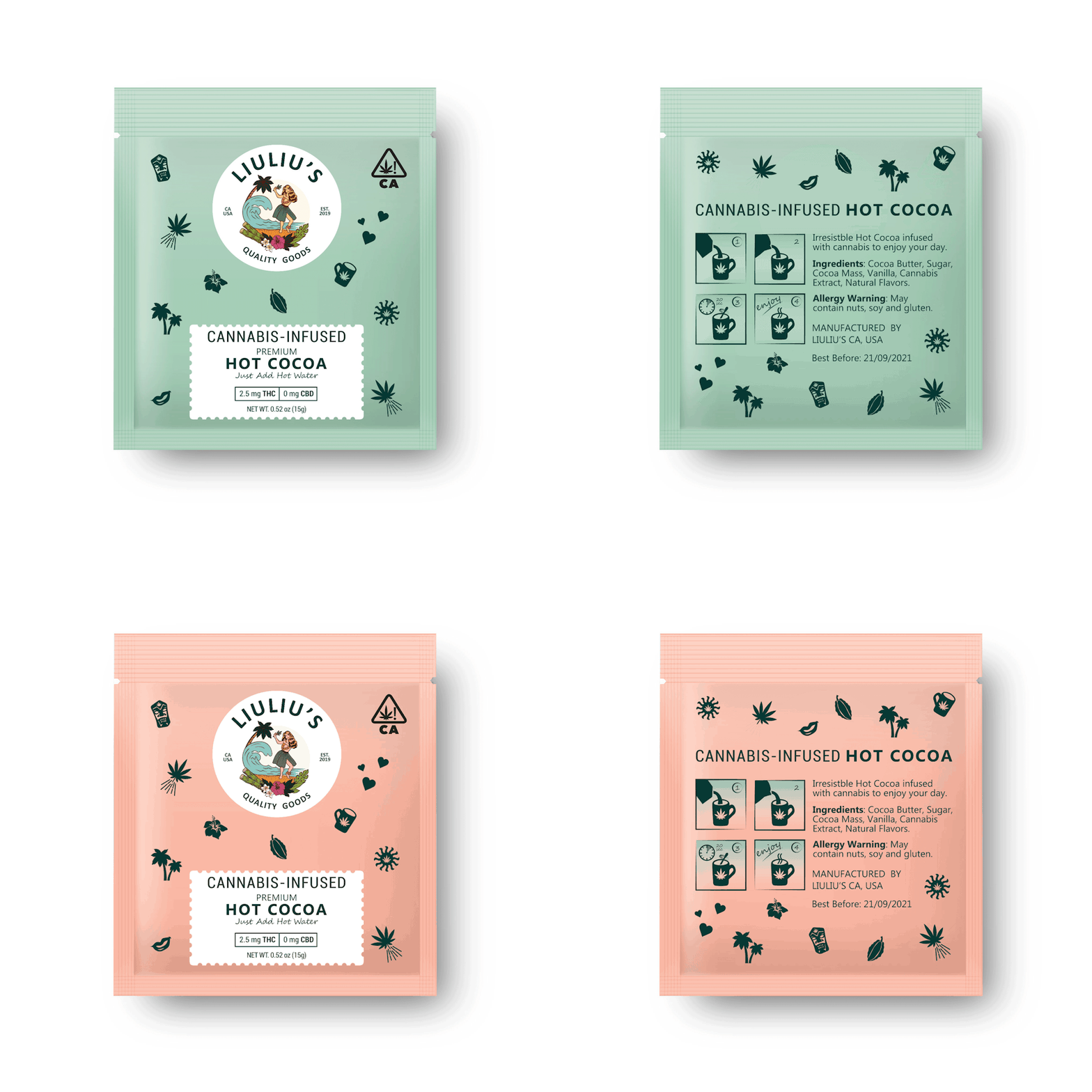
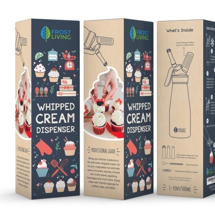
Patterns and illustrations can be so much more than just embellishment. They can reveal what a product is all about. In 2021, expect to see a lot of intricate patterns and tiny illustrations on packaging, and expect it to be doing one specific job: giving you a hint about what’s inside.
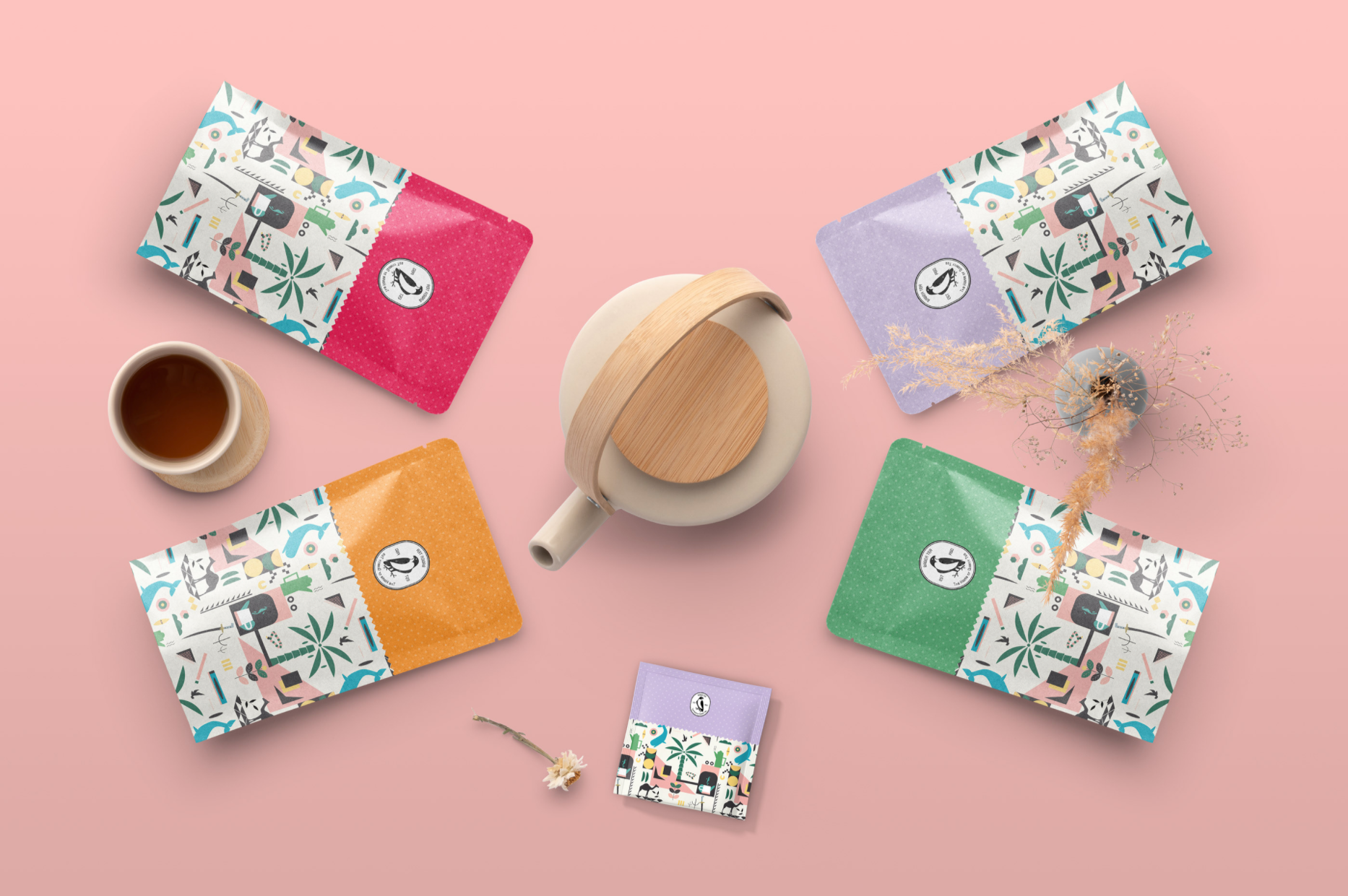
These illustrations are often simplified or abstract, giving you more of an artistic rendering of what’s inside the package than a literal look at the product itself. For example, instead of a photo of actual tortilla chips, a chip brand might decorate its bags with a triangle pattern that’s reminiscent of tortilla chips.
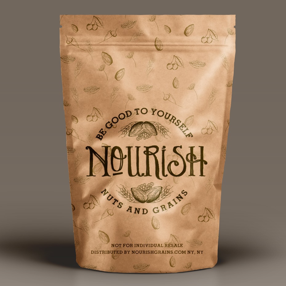
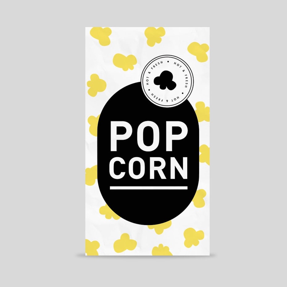
In 2021, expect to see packaging design that uses small illustrations and patterns in whimsical ways just like that. Intricate patterns like Gstar’s design for Nourish or the cute, minimal popcorn pattern by Cime show you everything you’re getting without overwhelming you with a complicated, overwhelming image.

Packaging design by Urukova
Packaging design by Gstars
Packaging design by Cime
Packaging design by FreshApple
2. Authentically vintage unboxing experience
—
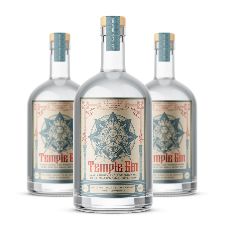
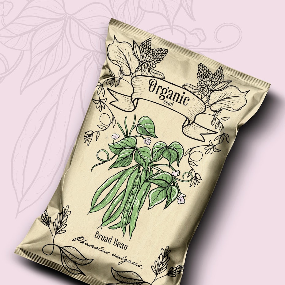
Vintage-inspired packaging has been a trend for a while now, so what’s different about it this year? The fact that the whole unboxing experience looks so authentic, you’ll think you travelled through time.
In 2021, you’re not going to see a bunch of generically vintage-inspired packaging. You’re going to see packaging that has an authentically old-school look and feel that is taking things further by creating a complete immersive experience. You’ll come across packaging designs that look almost indistinguishable from something your great-grandmother would have used, transporting you to a different moment in time.
That means going beyond logos and labels and encompassing the whole brand experience, making use of vintage-inspired textures, bottle shapes, materials, outer packaging and imagery choices. It’s no longer enough to give a package a few fun retro details. Now the package itself feels like it was plucked from a shelf that was frozen in time.


Packaging design by Agi Amri
Packaging design by balsheentayo99

Packaging design by G@rry
Packaging design by GoodEnergy

3. Hyper-simplistic geometry
—
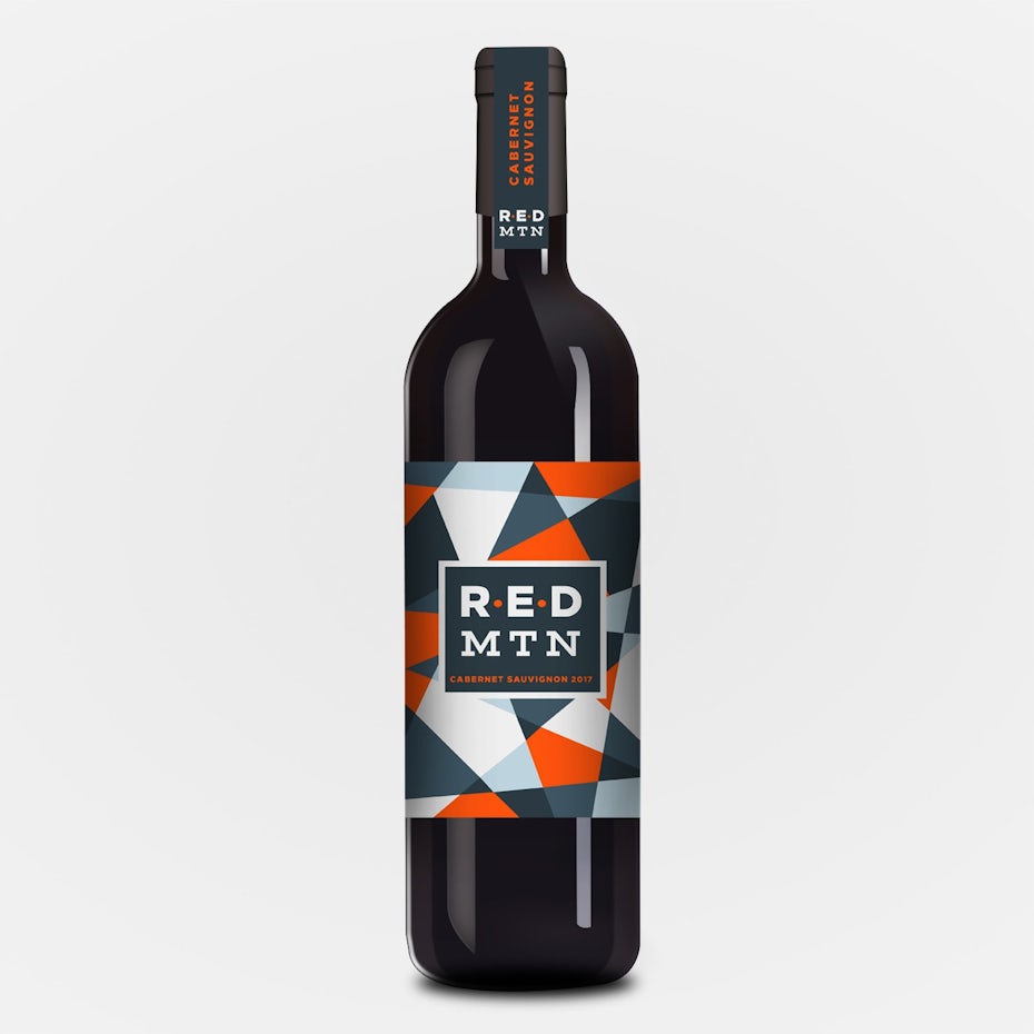
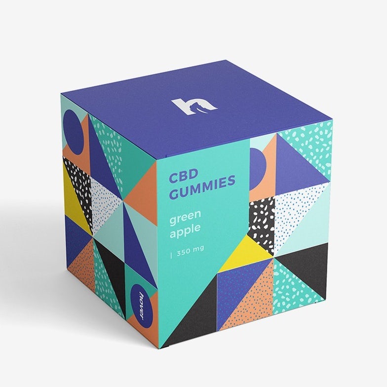
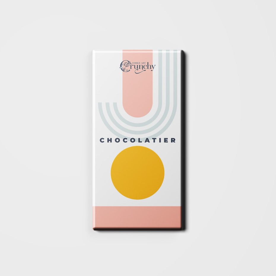
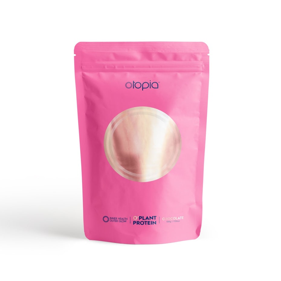
Another one of the packaging trends we’ll be seeing a lot of in 2021 is designs that make use of extremely simplistic, yet bold geometric concepts.
Wine label design by ed-creative
Packaging design by monostudio
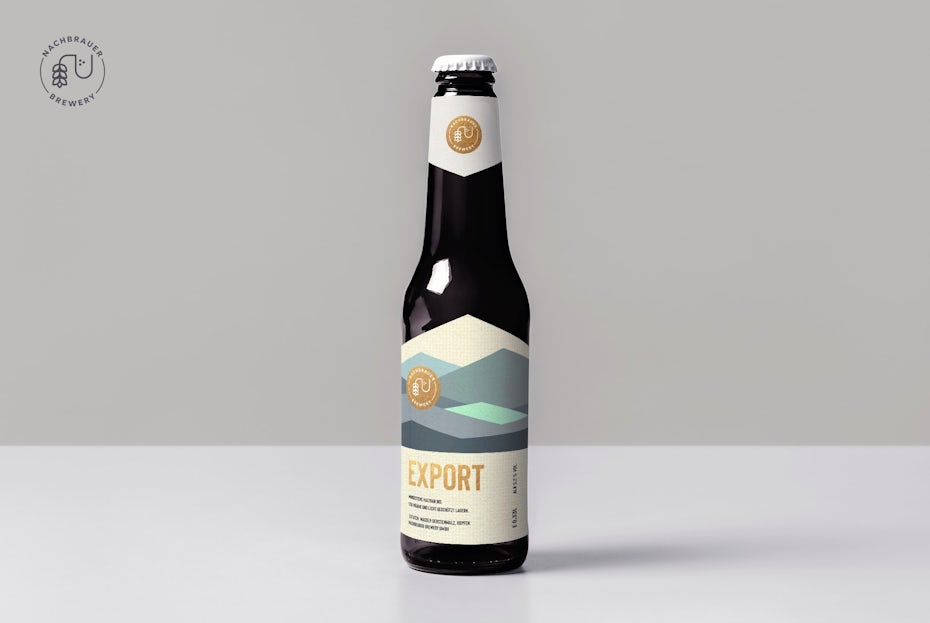
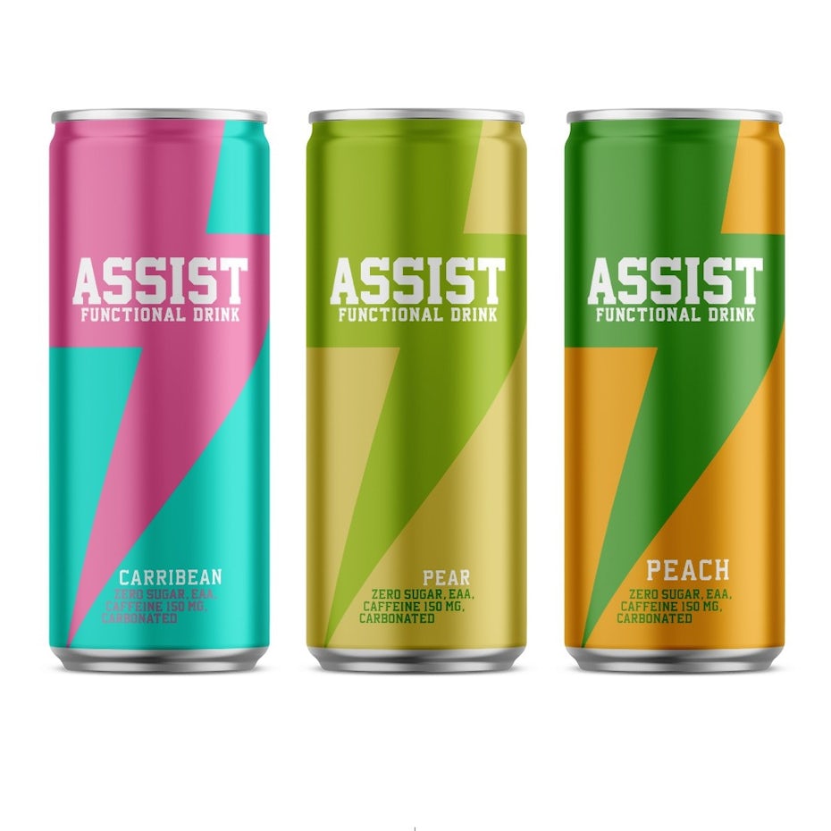
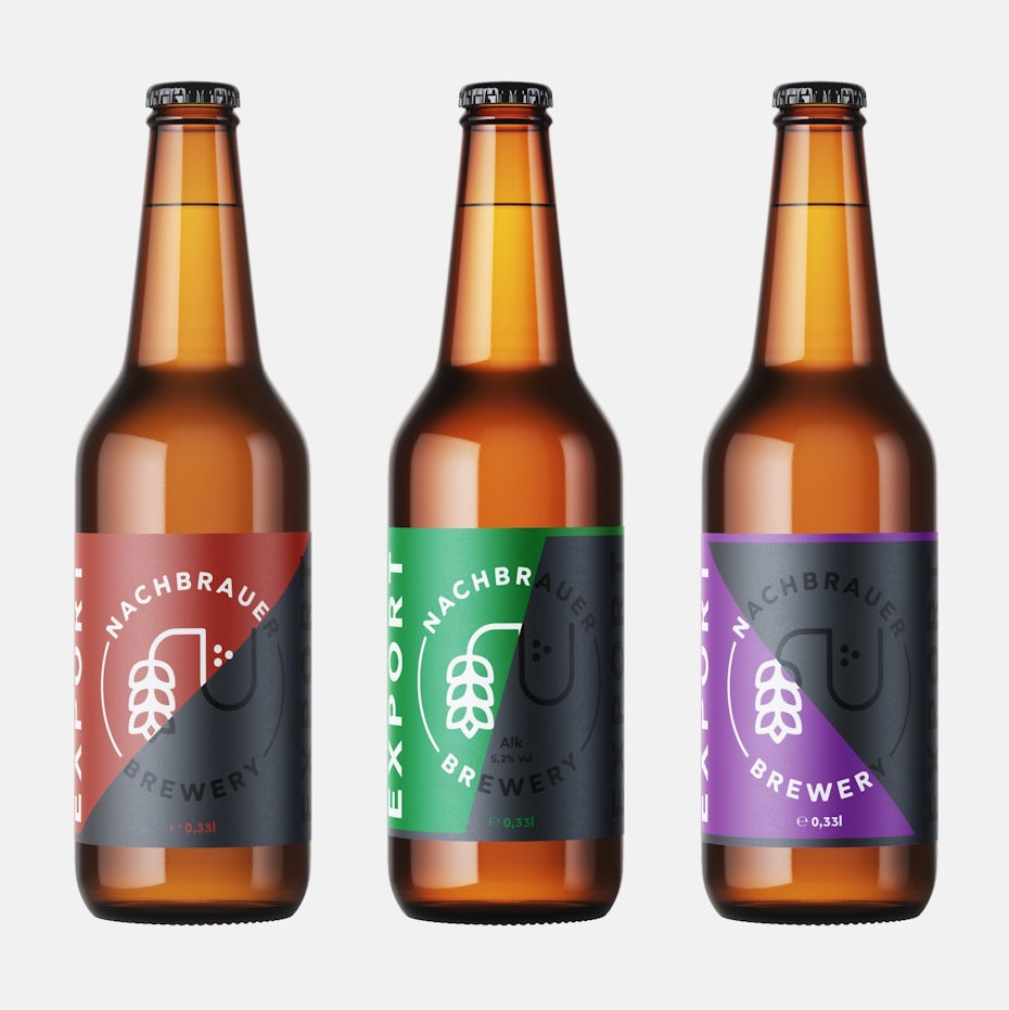
We’ll see bold geometry with neat lines, sharp angles and expressive colors giving packaging designs an edge (literally). Much like the pattern trend, this trend gives consumers a sneak peek at what a product stands for. But unlike patterns and illustrations, which depict what’s inside the box, these designs are abstract to the extreme. It may seem simple at first, but it’s an incredibly impactful way for brands to make a statement and leave a lasting impression.
Packaging design by Senchy
Beer label design by lliiaa
Packaging design by 01001101
Product packaging design by Nubia Design
4. Packaging dressed in fine art
—
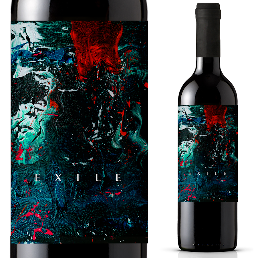
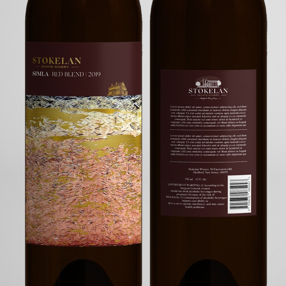
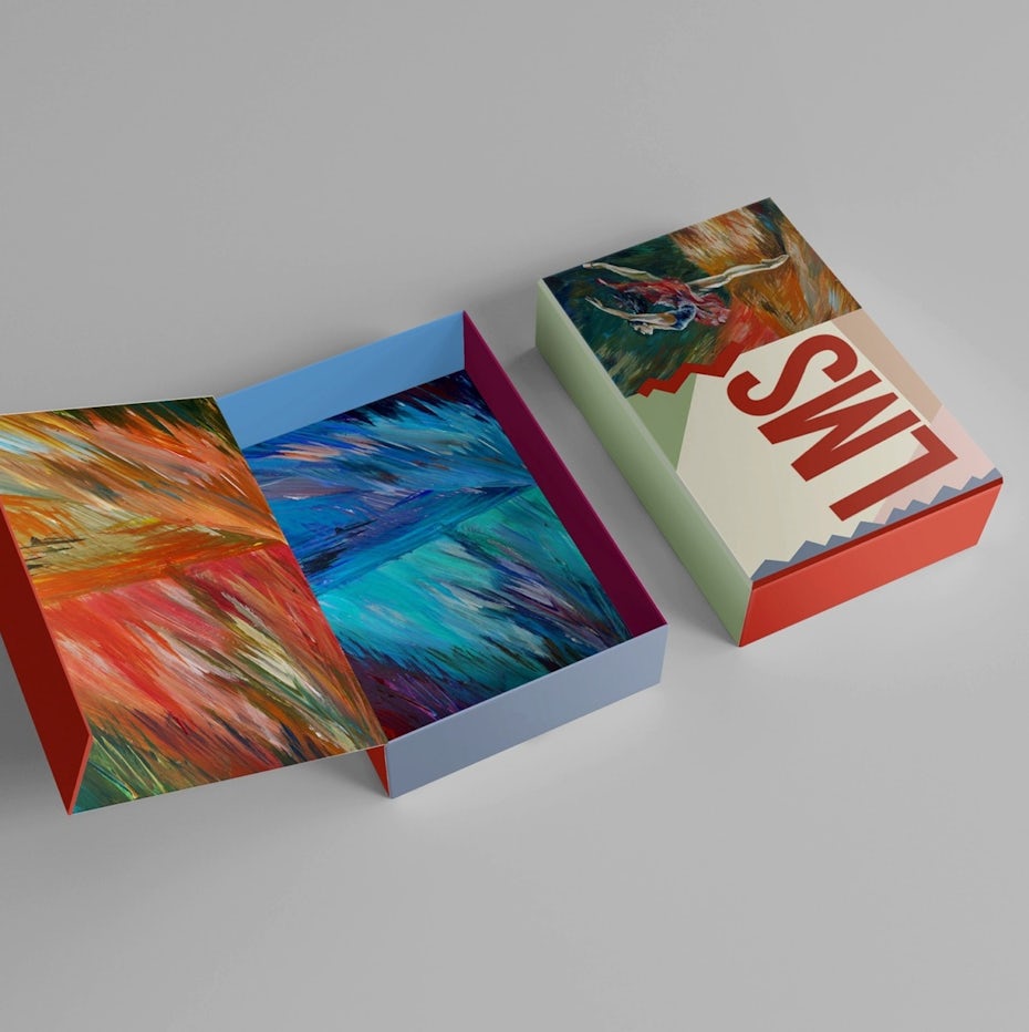
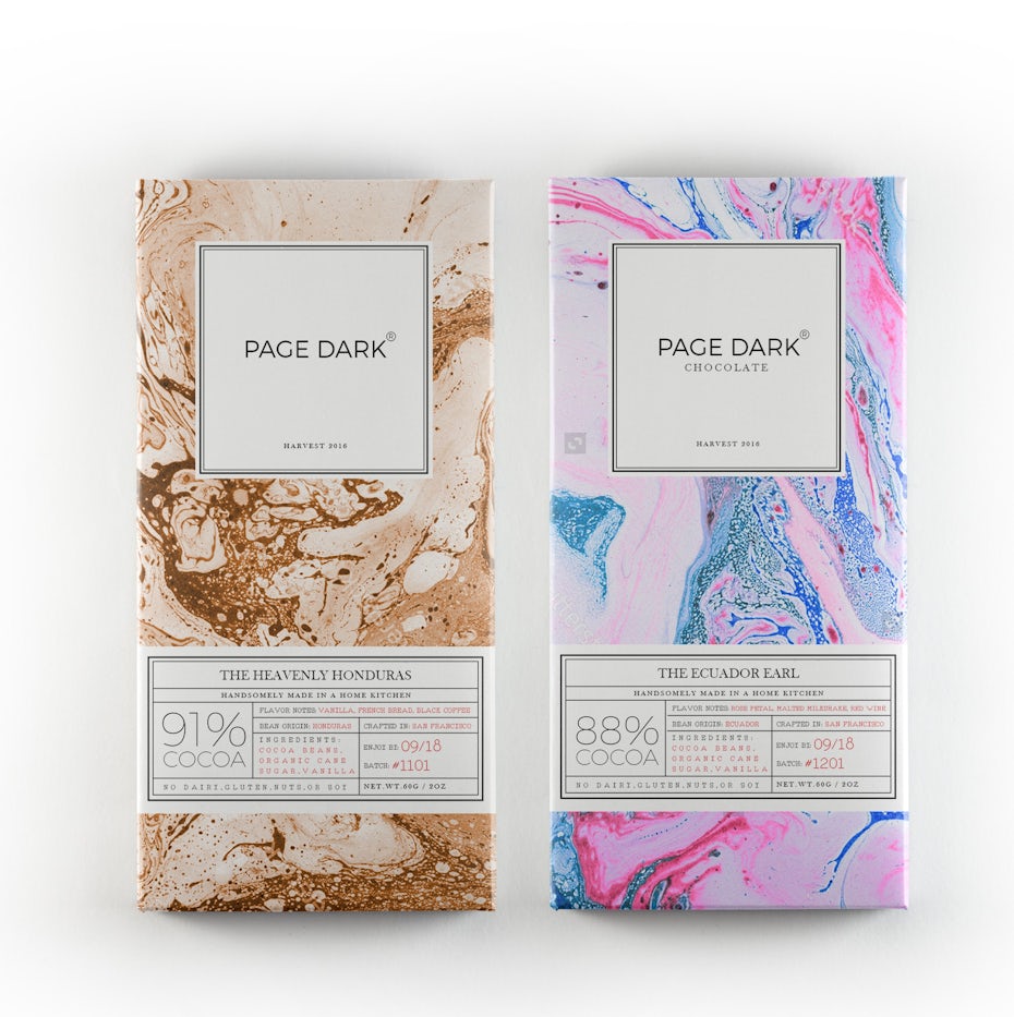
In 2021, expect to see lots of packaging designs where the packaging itself is a piece of art. This trend is mostly gaining momentum with high-end products, but you could see it on mid-range products too. Designers are drawing inspiration from paintings and paint textures, either playfully integrating them into their designs or making them the focal point. The goal here is to blur the line between packaging design and fine art, demonstrating that anything, even a bottle of wine that will eventually end up in the recycling, is beautiful and unique.
By LucaToni

Beer can design by Ostecx Creative via Behance

Album cover design by _Ossobuko_
Wine label design by Windmill Designer™

While some designers like to draw inspiration from the old masters (like the cheese packaging above), this trend largely draws from abstract paintings and fluid painting techniques. Texture is key here, and packaging designers are emulating the kinds of textures and effects you’d see on a long-dried oil painting or a freshly-poured resin painting.

Packaging design by Tatiana Ilina
Packaging design by Emir Alcic
5. Technical and anatomical ink drawings
—
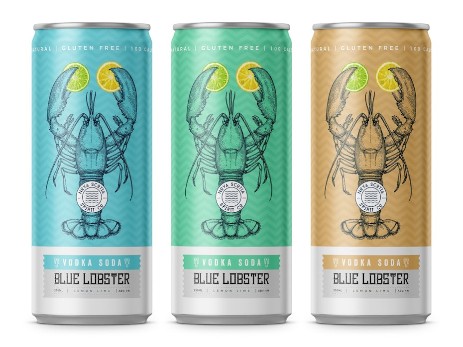
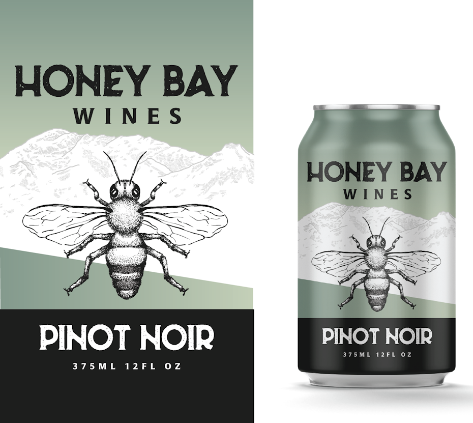
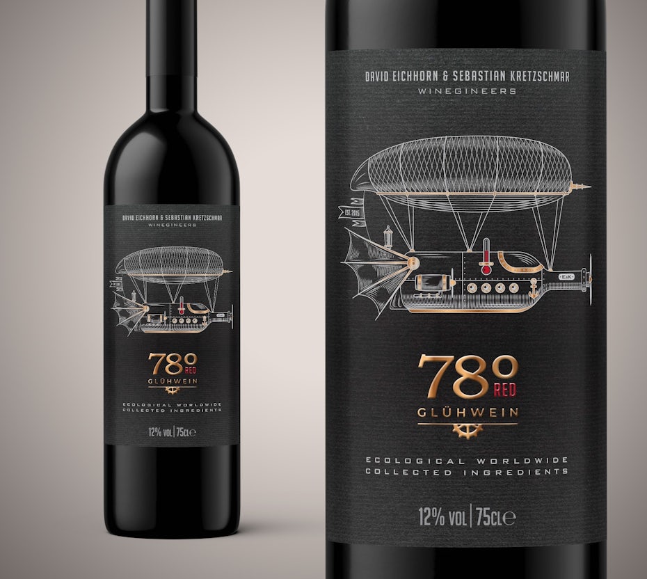
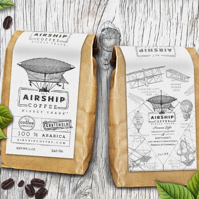
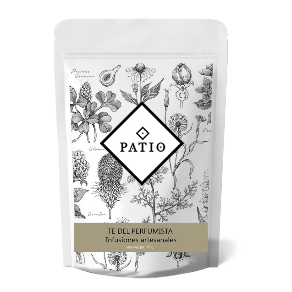
Seeing the theme yet? Overall, 2021’s upcoming packaging trends feel way more “art gallery” than “commercial graphic design.” Alongside bold geometry and tactile textures, you’re also going to see a lot of your favorite (and soon-to-be favorite) products packed up in designs that feel like they were pulled right out of an anatomical illustration or engineering blueprint.
Product packaging design by Footstep
Packaging design by Sonia Maggi
Perhaps it’s because 2020 forced us to slow down and reevaluate what’s really worth doing, or maybe it’s a response to the years that minimalism reigned supreme in packaging designs. In any case, prepare to see more designs with incredible detail that look and feel like they were sketched and inked by hand for an ancient (and sometimes surreal) science publication.
Product packaging design by Martis Lupus
Packaging design by LizYee

Product packaging design by G@rry

Product packaging design by GOOSEBUMPS
6. Organically shaped color blocking
—
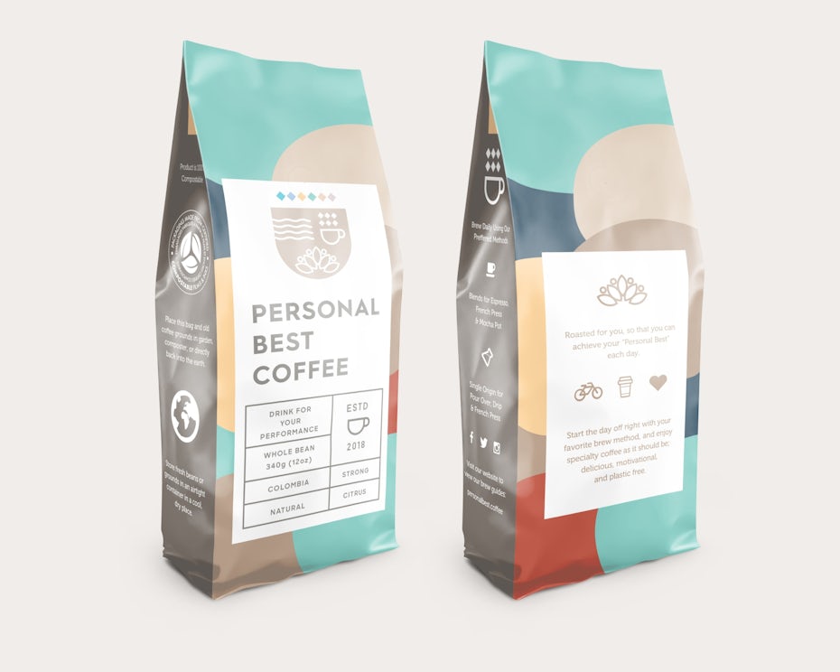
Color blocking is nothing new. But color blocking in blobs and blips and spirals and dips? So 2021.

What separates 2021’s organic color blocking from previous color blocking trends are the textures, the unique color combinations and how much the blocks vary in shape and weight. These aren’t clear, straight-edged boxes of color that make perfect grids and clean lines; they’re uneven, unbalanced, freckled and dappled collages that feel inspired by an eclectic flower garden or a dalmatian’s coat. They feel real, they feel organic.


Packaging design by Eva Hilla
Packaging design by gromovnik
Patterns are blocked on top of colors, designers play with unexpected color palettes and shapes like spirals and squiggles find their way into these packaging designs, like JianBranding™’s design for Little Rituals.

Packaging design by JianBranding™
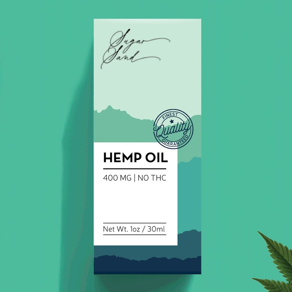
Packaging design by Jelena M.
7. Product names front and center
—
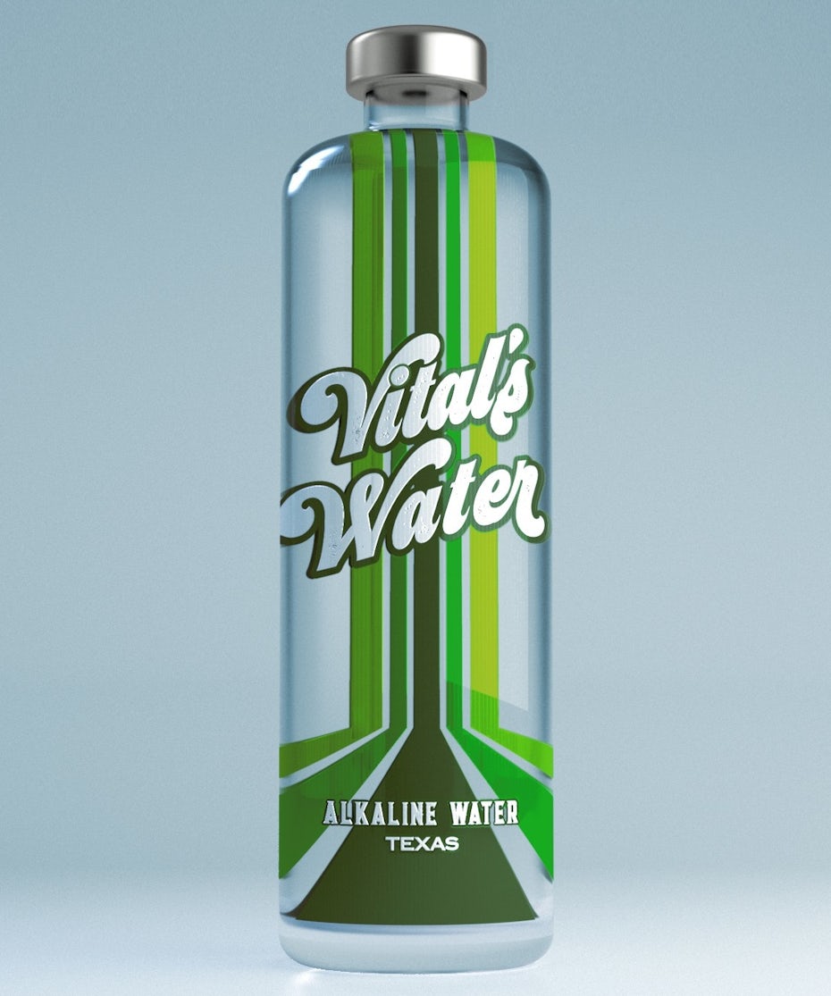
Instead of making an illustration or logo the packaging’s focal point, some designers are instead choosing to make the product’s name the star of their designs. These are designs that get extremely creative with lettering to allow the product’s name to take center stage. Each name on these packaging designs feels like an artwork in itself, giving the whole design a distinctive personality.
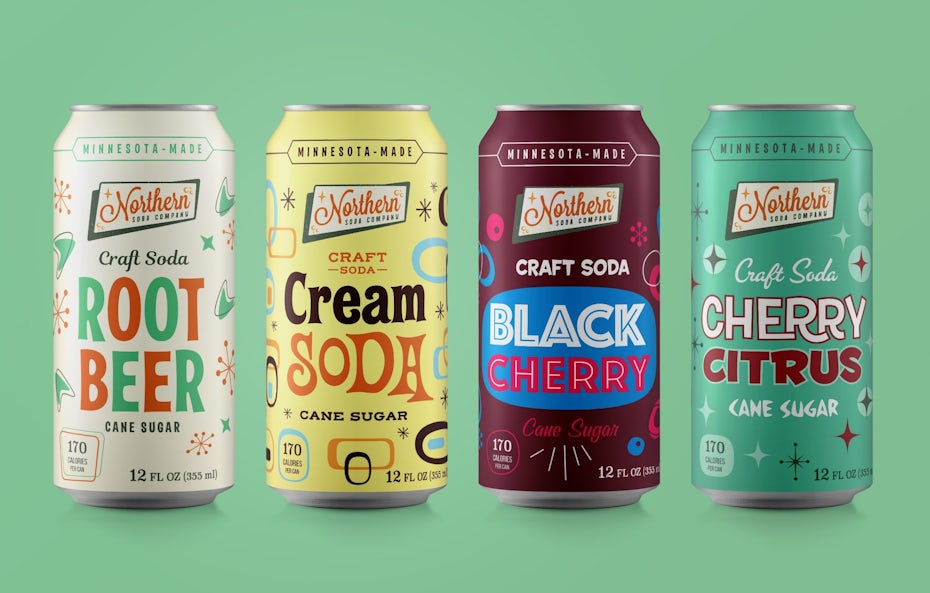
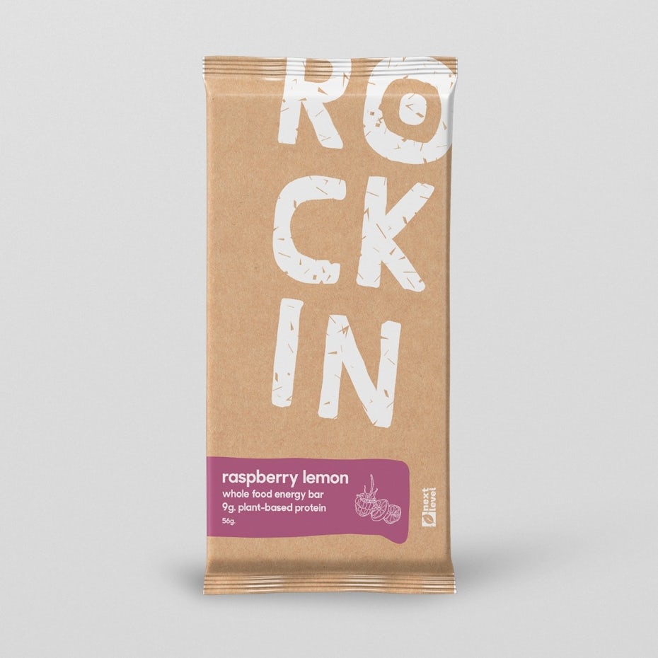
Packaging design by domo design

Label design by MANTSA
With this kind of packaging, there’s no doubt about what the product’s called or what kind of product it is, making this the perfect packaging trend for product-focussed businesses that aim to increase brand awareness. These designs rely on strong typography that can carry the brand’s whole aesthetic. Any additional design elements are just there to make the name shine.

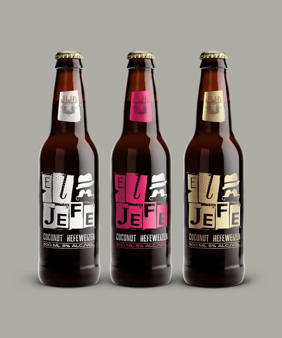
Packaging design by Mila Katagarova
Packaging design by :-DiegoGuirao
8. Picture-perfect symmetry
—
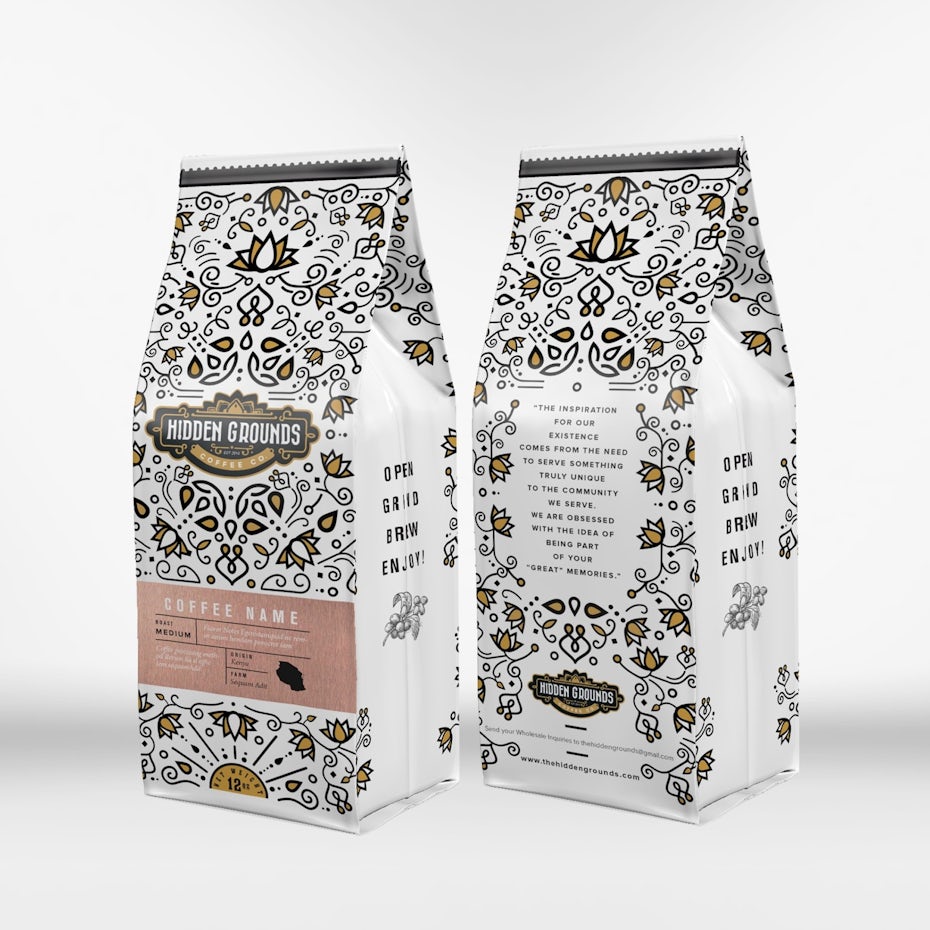
It’s not uncommon for a year’s top trends to contradict each other. In fact, it happens almost every year, and 2021’s packaging trends are no different. While some packaging designers play with organically imperfect shapes in their designs, others are swinging far in the opposite direction and creating pieces with perfect symmetry. These designs appeal to our sense of order, giving us a sense of grounding amid the chaos.

Packaging design by Mj.vass

Packaging design by merci dsgn

Not all the designs that fit into this trend are tight, intricate designs. Some, like Raluca De’s design for Yerba Mate original, are looser, more disconnected patterns that incorporate negative space for a less closed-in feel. They’re just as perfectly symmetrical as the more complex designs, though, which creates the visually satisfying sense of perfection that’s characteristic for this trend.

9. Story-driven packaging featuring quirky characters
—
Storytelling is a key part of any effective branding, and in 2021, you’re going to see lots of brands extending their storytelling to their packaging.
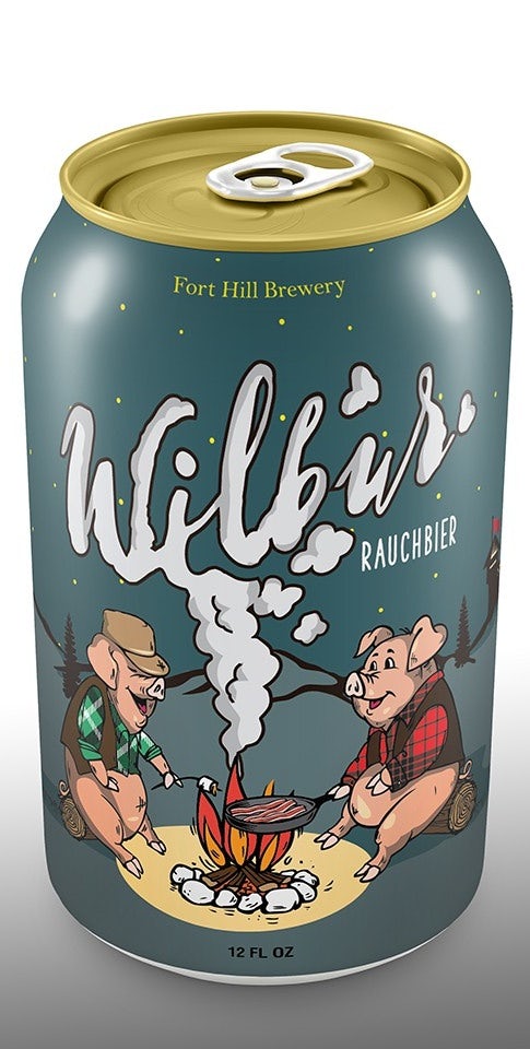
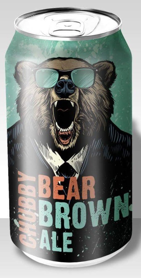
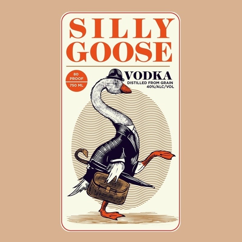
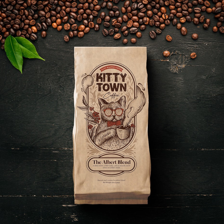
2021 will bring us characters that go beyond being mascots to seemingly living their own fleshed-out stories. And instead of just being static mascots, you’ll see these characters in scenes, like you’re looking at an individual panel of a graphic novel. So instead of having to head to the brand’s website to read their story or inferring their brand story through the ads they run, you’ll have the main character delivered right to your door, telling you a story right from your buy’s package.
Beer can design by ultrastjarna
Beer can design by drawziart
These characters bring their brands’ stories to life, often in a cartoonish, fun way that makes you feel like you’re reading a comic book as your eye travels through the packaging design. One example is St. Pelmeni’s stunning Peachocalypse design, which gives us a full scene of a giant peach attacking a city.


Label design by monkey-mother
Label design by Wintrygrey
Packaging design by K .art
10. Solid all-over color
—
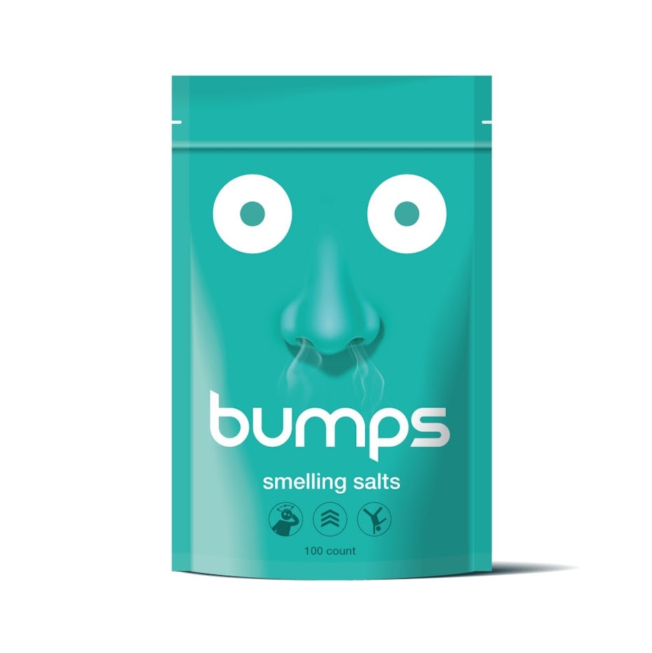
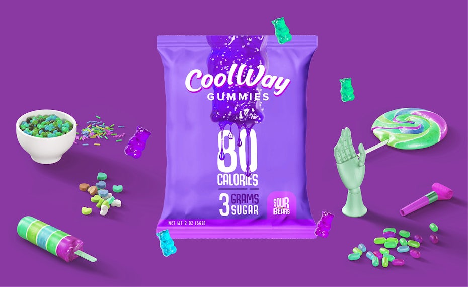
Right alongside bold packaging that reads like a comic book, you’ll see products packaged in single colors. Although it’s working with a far more limited palette, this packaging trend has no less character than any of the others in this list. In 2021, expect to see packaging designs that let the copy and (often unconventional) color choices do all the talking.

Packaging design by yand.
Packaging design by HRSMA

One thing you’ll notice about these packaging designs is that for the most part, they’re using bright, bold colors. That’s what makes this trend feel so fresh—this isn’t the sterile all-white packaging your Macbook came in; these designs are loud, in-your-face and take a decidedly bold tone. And in the instances where they don’t, like Eva Hilla’s design for Babo, they choose an unusual shade that creates a mood and guides the buyer’s eye directly to the copy. By doing this, they build anticipation by telling the buyer about the product, rather than showing it immediately.

Packaging design by Eva Hilla
Packaging design by vitalfuerze

Ready for the biggest 2021 packaging design trends?
—
If you’re planning on unleashing a new product on the market in 2021—or redesigning a current product’s look—pack it up in one (or more!) of today’s hottest trends. Great packaging design gets buyers pumped about your product before they even open it, so don’t miss the opportunity to wow them from the second they see it.
Source: https://99designs.com/blog/trends/packaging-design-trends/
